A selection of case studies showcasing my transformative projects in the realm of user experience enhancement. My current role all work is proprietary.
- Corporate Website Redesign | Company: Salt River Project | 2020 – 2022
- Program Sign-up Improvement | Company: Salt River Project | 2019 – 2021
- UX/UI Artifact Examples
Corporate Website Redesign | 2020 – 2022
Salt River Project (SRP)
Background
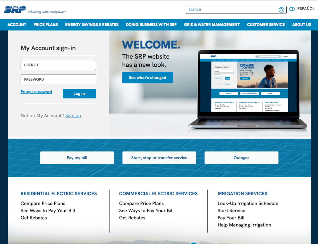
The SRP customer facing website was built in the early 90’s. It had been updated periodically but there had never been a large scale redesign. In addition, over time, separate sites had been built based on sub-sets of the larger target audiences creating a disjointed user experience.
Case study is as of Aug. 2023
Challenge
Our team was tasked with creating a wholistic user experience by merging three separate websites, and further optimizing the mobile experience.
We saw this as an opportunity to:
- Complete a site content audit
- Evaluate the functionality and figure out what was missing
- Perform user research to deepen our understanding
I provided a new perspective on how to accomplish this by focusing on data and recommending user research methods. I wanted to make sure we could support our decisions and champion UX throughout the company.
Project overview and timeline
We conducted thorough research using design thinking methodology to understand the current environment and user needs.
I had already introduced user research to internal groups while working on refreshing the employee intranet information architecture. This helped pave the way to spend the first half of the project gathering data, user testing and collaborating.
Core work was completed collaboratively with:
- research,
- content and marketing,
- measurement, performance and analytics,
- visual design,
- copy writers,
- subject matter experts,
- several IT groups, and
- SEO consultant.
2020-2021: Research to understand
- Tree tested existing information architecture of SRPnet.com.
- Card sort completed and findings shared with internal stakeholders.
- New information architecture developed using research findings and in collaboration with internal stakeholders and SEO consultants.
- Content audit of all three sites (709 pages) and evaluation using website analytics and SEO data.
- Tree tested new architecture.
- We user tested two versions of high fidelity prototypes, making sure to test the removal of legacy features.
- Piloted testing with Spanish language users by performing a first click test.
We shared progress with internal teams throughout the project, which gave us an opportunity to introduce the new research methods we were using.
These included tree testing, card sorting, and content auditing; techniques previously unfamiliar to our team.
2022: Build out and launch
- Designs finalized, content development began. Held 50 content framing sessions with internal partners for high priority pages. We completed over 100 content frames in total.
- We presented to project sponsors and received immediate approval.
- Re-designed key web forms including creating a new master Contact Us form the served all customer segments.
Building understanding
The result of our initial testing showed us that architecture and menu design was no longer serving our users.
- Prospective customers had the most difficulty locating topics.
- Long time customers more often knew where to go, but we were seeing a substantial increase in new customers and needed to make sure the site was navigable by all segments.
The highest success rate out of four user segments was only 41%.
Ideating
The initial tree test showed us that there was a lot of duplication across the site and circular pathways.
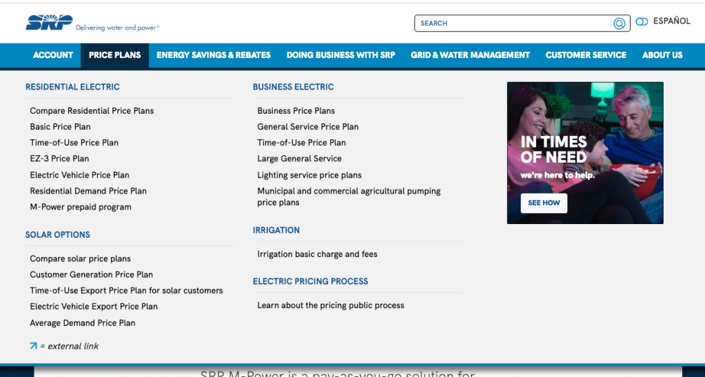
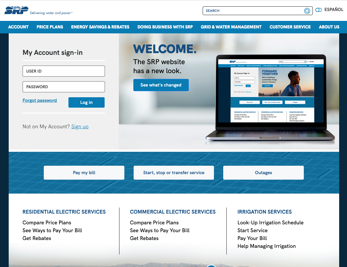
The new information architecture attempted to alleviate this issue by flattening the structure and moving to a mega menu.
UI design elements
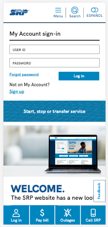
After finalizing the information architecture, the mobile first visual design was developed. We focused on:
- Expanding the number of quick access tasks available on the home page.
- Removing elments that had historically performed poorly and hiddden content such as a home page carousel.
- Added on page navigation elements to reduce users cognitive load.
- Aligning high priority content to buisness goals and users tasks by core modeling pages.
- Compliance with WCAG 2.1 at a AA level .
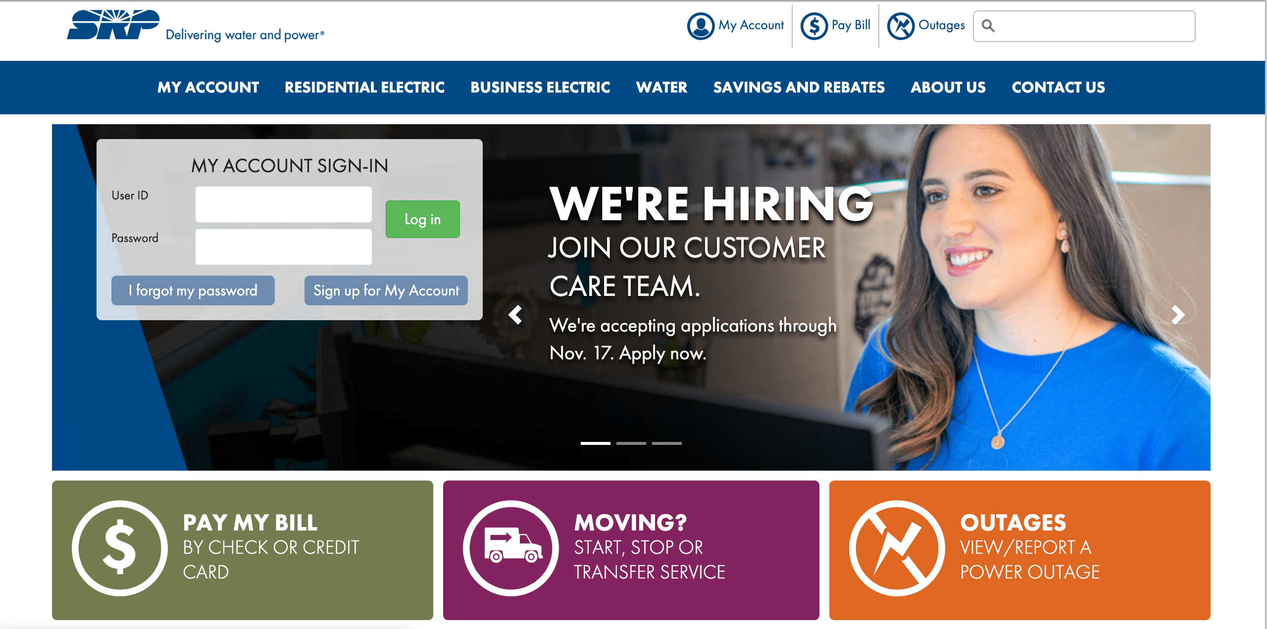
Users loved new sticky buttons at the bottom of the mobile experience.
“I like the contact option at the bottom of the mobile site – seems easy to find.”
“I like having the direct button to the outages persistent on every page.”
“Most people go to your webpage to login, so therefore it should be easy and prominent.”

Materializing: Testing our designs
User testing provided us the data needed to finalize the design and support it as we presented it to stakeholders and for approval. We performed a tree test and created high-fidelity prototypes for user testing.
We found that:
- Overall navigation and task completion was relatively high among both desktop and mobile prototypes.
- New language toggle functionality was easily found and customers noted its inclusivity.
- Both user groups were complimentary of updated price plan comparison charts designed to reduce cognitive load.
- On page navigation was utilized and users commented it made it easier to navigate the more robust content pages.
Project Outcomes
The website was launched in July 2022. An extensive evaluation of customer satisfaction and analytics monitoring began shortly after.
- We saw a 9% increase in customer satisfaction four months after launch. The most significant growth seen in these scores since they began tracking in 2009.
- Anecdotally, we’ve received positive feedback from internal partners and some customer complaints about the change (as expected).
- Analytics showed us lower bounce rates and a higher time spent on site when compared to the same time period in 2021.
“I think it (the website) has improved over the past year. “
Customer in response to survey about redesign.
Artifacts
The following were created for the project but most are proprietary and therefore not displayed. See example artifacts below.
- Visual information architecture diagram created using Mural.
- Content Frames/Core Model documents.
- Wireframes – both low and high fidelity.
- Web form technical specifications that included: form hosting, back end database connections, roles/responsibilities for any APIs, user profiles, form field validation and low fidelity wireframes.
- Functional requirements list to provide to vendors for customization of new system.
- Page and form inventories.
Program Sign-up Improvements | 2019 – 2020
SRP
Challenge
Salt River Project sought to improve their online application process for a long-standing program. My task was to streamline the procedure and reduce the processing time, as delays were causing customer compensation checks to be issued late.
Attempt 1
Understanding
I began by having informational interviews with the program manager, business analyst and developer. From these conversations I was able to gain insights into the complete process flow and identify potential pain points for users.
Exploring
I redesigned the application’s form to make it easier for users by showing them only the fields they need to fill out, step by step.
I created low-fidelity wireframes and written specifications to gain necessary approvals. The documentation was then passed to the developer.
I also advocated for an earlier start date to allow for sufficient testing.
Materialize
Soon after launch a significant bug was found. Analytics showed that 83% of users reached page two of the four-part form. At that point, the success rate dropped to 7%.
Due to the short duration of the program application period (only three months), the decision was made to leave it as is.
Our business goal to increase online applications was met. However, our customers and internal partners were still experiencing high levels of frustration due to the bug.
Attempt 2: Success!
At this point, I had a solid understanding of the program, the user experience issues, and the business goals and needs. However, fixing the bug was complicated by both resource limitations and additional requirements being added.
Exploring
I began making contact with different teams to investigate the software options that our company already had.
My objective was to locate a solution that could repair the issue with the web form and simultaneously include the new feature of document submission.
Ideating
- I first worked collaboratively with the research team to have a service blue print created.
- I then developed detailed user stories.
- Once we identified a possible solution (DocuSign) I created a wireflow to connect the web experience to DocuSign.
Materializing
The combination of a web form plus DocuSign Powerform was successful.
We saw a 20% increase in successful submittals and a 74% customer satisfaction rate with ease of application process.*
*As of 2022.
Additional benefits included:
- Through the use of DocuSign, we were able to enhance the accuracy and reliability of our data.
- Collaborating more closely with our IT teams allowed us to optimize our resource management, leading to a decrease in labor costs year over year.
- We achieved our primary objective of reducing processing time by promoting the submission of applications online.
Artifacts Used
The following were created for the project but most are proprietary and therefore not displayed. See example artifacts below.
- Service Blueprint (produced by research partner)
- Technical specifications that included detailed overview of systems, user stories and web form wireflow (word + Adobe XD)
- Field/Database map (Excel)
UX/UI Artifacts Examples
Due to my current position, I can only share artifacts for some completed projects. I created most of the examples below while completing my UX/UI certification.
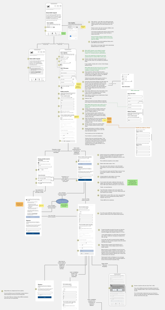
Wireflow for a web form rebuild for Salt River Project. Used a mobile first approach and annotated due to timeline constraints. Created using Mural. 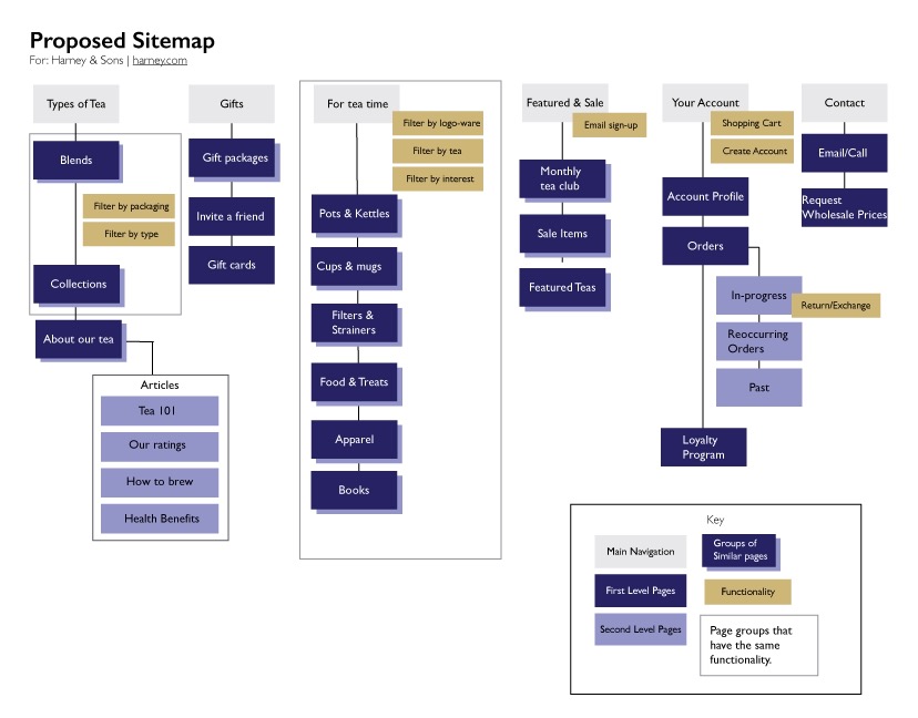
Visual sitemap created based on tree testing and card sorting. Used Adobe Illustrator to create graphic. Completed as part of UX/UI certification. 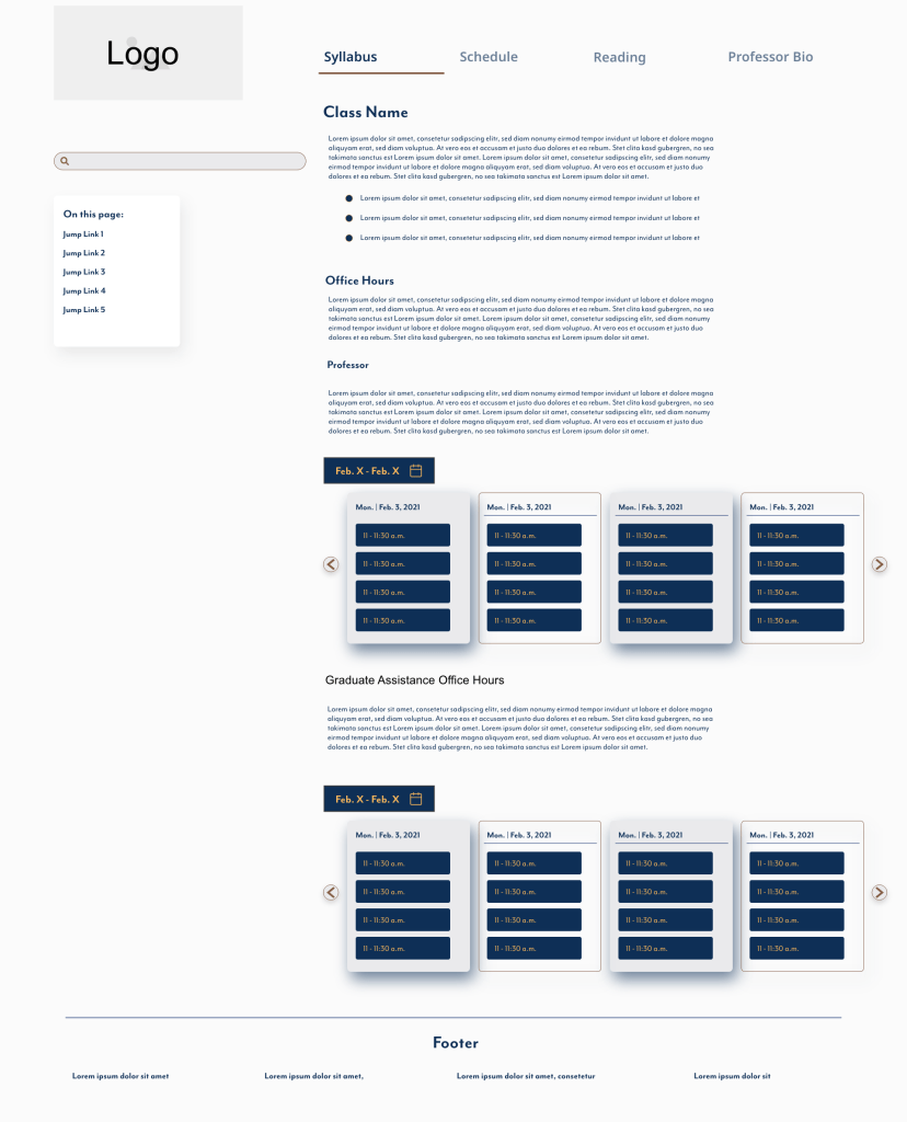
Medium fidelity prototype created using AdobeXD. Completed as part of UX/UI certification. 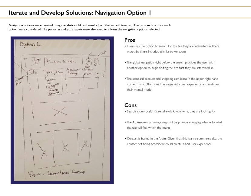
Low fidelity wireframe created to show navigation options. Completed as part of UX/UI certification project. 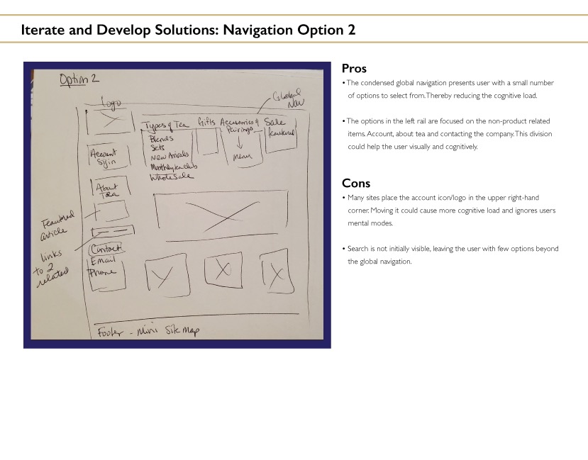
Low fidelity wireframe created to show navigation options. Completed as part of UX/UI certification project. 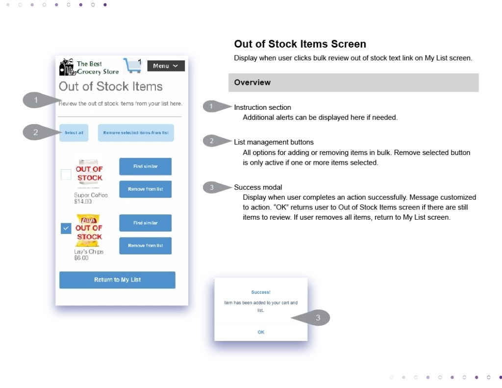
Annotated wireframe created as part of project for UX/UI certification. Prototype created using AdobeXD. Annotations added in Illustrator. 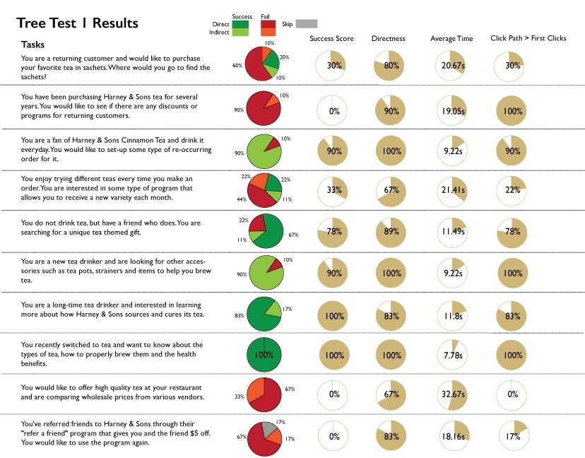
Tree test performed using Optimal Workshop. Results compiled and graphic created using Illustrator. Completed as part of UX/UI certification.
