I’ve worked in the digital communications field for over 13 years building my user experience/user interface design skill set.
Want to chat? Send me a note via LinkedIn.

Portfolio
The main focus of my work has always been to improve the user experience. Below are case studies of my most recent, dare I say coolest, projects.

Website Redesign
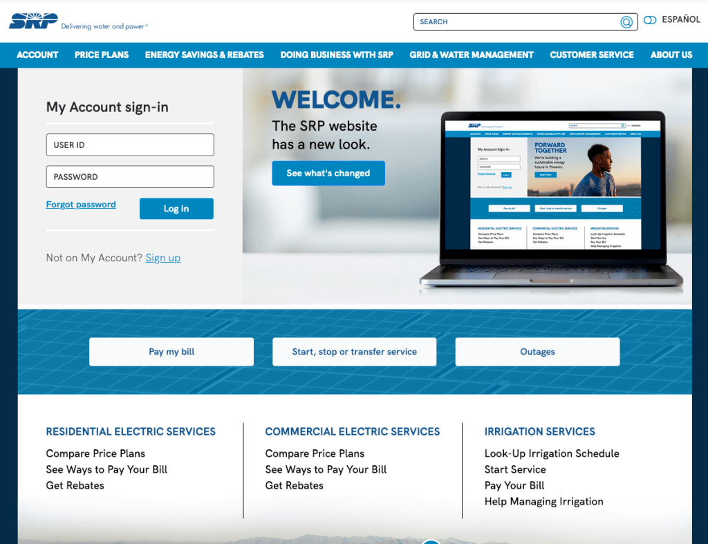
The SRP customer facing website was built in the early 90’s. It had been updated periodically but there had never been a large scale redesign.
The following pain points were the focus of the project:
- Incorporate content from microsites back into the core site,
- Create a flexible architecture that was aligned to user mental models and supported business goals,
- Develop a new multilingual experience and eliminate the need to maintain a separate Spanish language site,
- Reduce content ROT, and
- Future proof site for eventual personalization.
Role
UX/UI Designer & Strategist
Timeline
2020 – 2022
Date Completed
July 2022
Empathizing
Our team was tasked with creating a wholistic user experience by addressing the pain points listed above.
We viewed this as a great opportunity to dive deep into the site content and functionality. We made a plan to try and uncover what was working for our users and what wasn’t, without bias or attachment to what had been done before.
I provided a new perspective on how to accomplish this by focusing on web analytics and user research. I wanted to make sure we could support our decisions. I viewed this as a way to champion UX throughout the company.

Defining
We started with research and began to educate internal stakeholders. I had already worked with several groups on updating the employee intranet and begun introducing various UX principles and research. This helped pave the way to spend the first half of the project gathering data, user testing and collaborating before we ever started building.

Research methods
A robust research plan was developed that included the following methods, many of which were new to internal stakeholders:
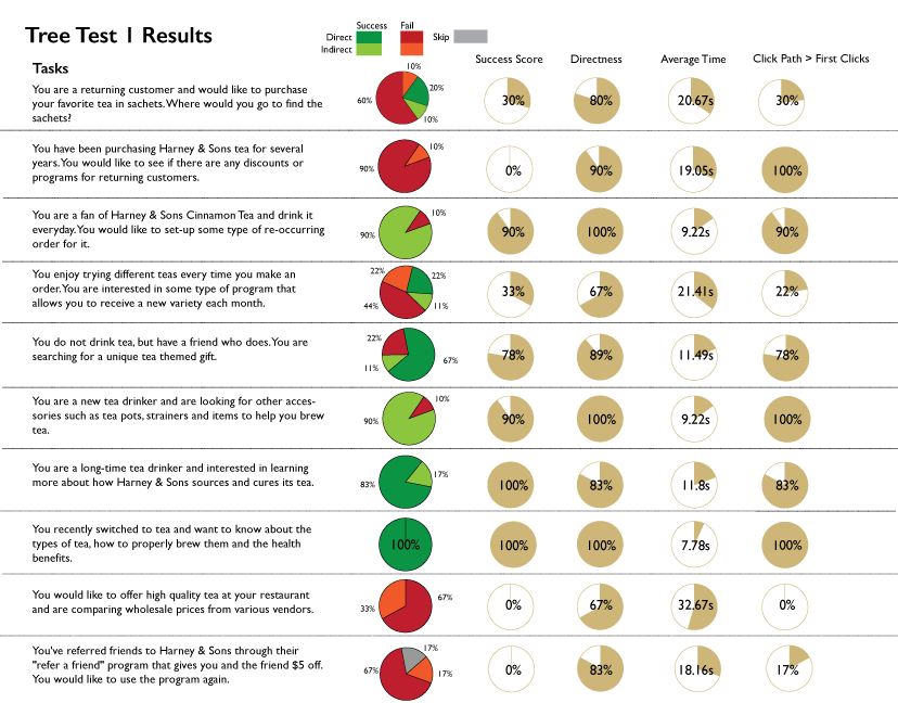
- Tree testing to evaluate the information architecture,
- Card sorting to gain a deeper understanding of users mental models of the content,
- Content auditing paired with web analytics and search data for 1,000 pages across the existing English and Spanish sites, and
- User interviews to understand how potential pain points and test prototypes, and
- First click testing to start baselining how Spanish users interacted with the new UI.
A cross-departmental team was created to evaluate the user tasks and pre-test the tree exercise.
Collaboration highlights
Core work was completed collaboratively with:
- research,
- content and marketing,
- measurement, performance and analytics,
- visual design,
- copy writers,
- several IT groups,
- and SEO consultant.
We consulted with subject matter experts from across the company to learn about customers from their perspective and develop new content.
We presented the results of our research throughout the project to key stakeholder groups. Ensuring they knew what was happening every step of the way.

Project Timeline
2020
- Research plan developed.
- Audited marketing project briefs to develop user tasks.
- Tree tested existing information architecture of SRPnet.com.
2021
- Card sorting exercise completed and findings shared with internal stakeholders.
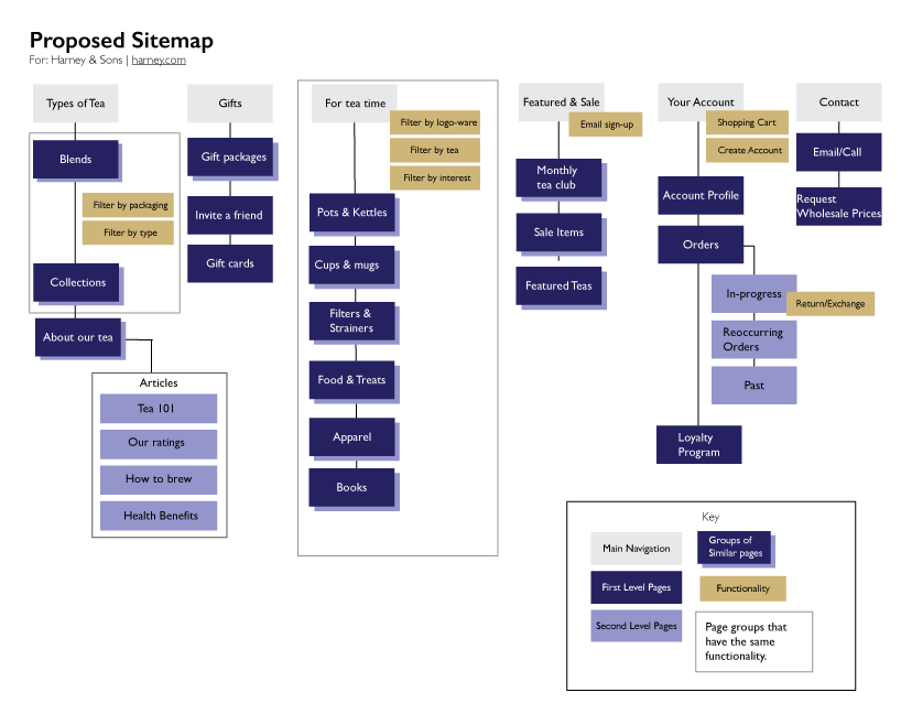
- New information architecture developed using findings from the tree test and card sort. In addition, we held collaborative sessions with internal partners, our team and a SEO consultants to define and develop the new information architecture.
- Content audit of all three sites was performed. This included pulling website analytics and SEO data for each page.
- The new information architecture was re-tested using a tree test before we began to build high-fidelity wireframes for user testing.
- We user tested two versions of high fidelity prototypes, making sure to test the removal of legacy features that internal partners had concerns about.
- Piloted testing with Spanish language users by performing a first click test.
2022
- Designs finalized, we began content development holding 50 content framing sessions with internal partners for high priority pages. We competed over 100 content frames in total.
- We presented to project sponsors and received immediate approval.
- Re-designed key web forms including creating a new master Contact Us form that would funnel customer inquiries to the correct department.
July 2022 – Website is launched.

User testing results
The result of our initial testing showed us that architecture and menu design was no longer serving our users. The pathways users followed to try and find content during the tree testing was vital to showing us, and internal stakeholders, users’ mental models.
Prospective customers had the most difficulty – which indicated that we were not utilizing an outside in thought process. Long time customers knew where to go, but with the growth in the city we had more and more new customers. We needed to get better about making our site usable for the newest customers.
The new information architecture attempted to alleviate this issue by flattening the structure and moving to a mega menu. We streamlined the homepage and internal pages to remove anything in the right rail.
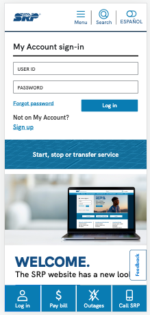
Users loved new sticky buttons at the bottom of the mobile experience as those were the top items/actions they came to the site for.
“I like the contact option at the bottom of the mobile site – seems easy to find.”
“I like having the direct button to the outages persistent on every page.”
User testing provided us the data needed to finalize the design and support it as we presented it to stakeholders and for approval.
- Overall navigation and task completion was relatively high among both desktop and mobile prototypes.
- New language toggle functionality was easily found and customers noted its inclusivity.
- Both user groups were complimentary of updated price plan comparison charts that were specifically designed to better represent their pricing options.
- On page navigation was utilized and users commented it made it easier to navigate the more robust content pages.
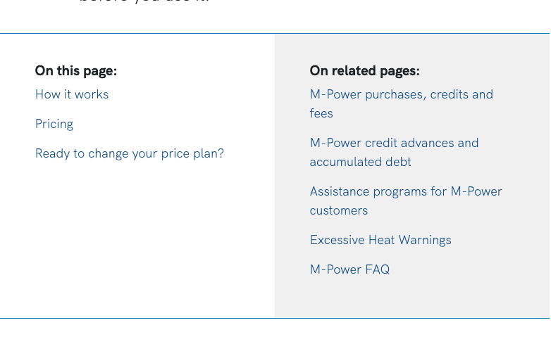
Information scent was improved by adding in-page navigation. 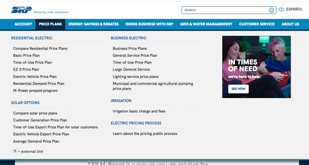
Mega menus surfaced more content. Labeling helped chunk it for easy scanning.

Project Outcomes
The site launched July 15, 2022* and we will begin evaluating the success within the next few months. Anecdotally, we’ve received positive feedback from internal partners and some customer complaints about the change (as expected – the customer base is very change adverse).
However, analytics are so far showing us lower bounce rates and a higher time spent on site when we compare to the same time period in 2021. Indicating that despite some complaints, the majority of customers are successfully finding the information they need.
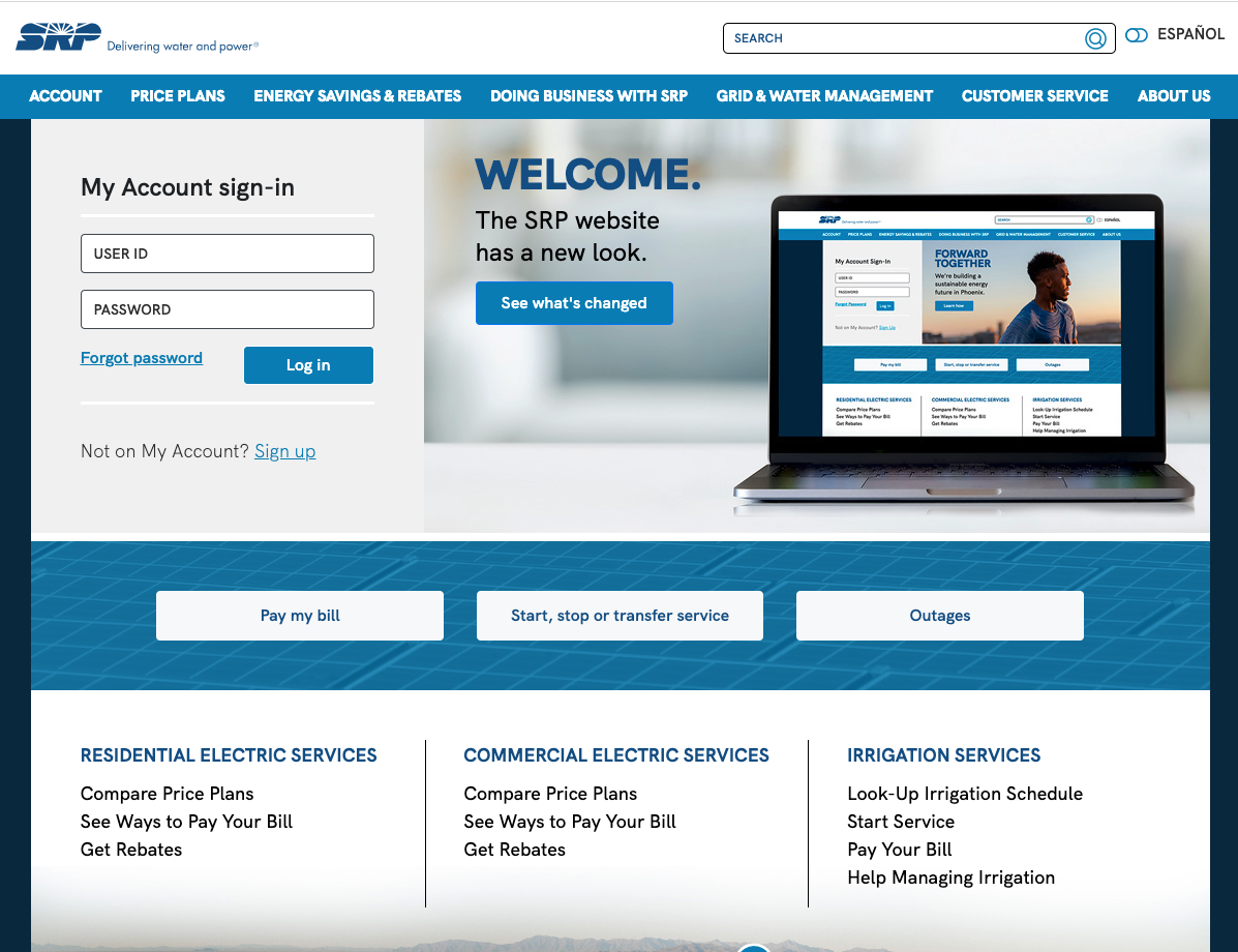
Internally, adding new pages has become simpler as the new architecture is more aligned to both internal marketing/communications initiatives and users needs.
We are actively working with analytics team to build Adobe Analytics dashboards to track the performance. Based upon this data, we will begin to plan further user research to continue to improve the experience.
*Case study posted in Aug. 2022
Artifacts
The following were created for the project but are proprietary and therefore not displayed. See example artifacts below.
- Visual information architecture diagram created using Mural.
- Content Frames/Core Model documents to hand off to copy and design.
- Wireframes – both low and high fidelity.
- Web form technical specifications that detail where the form is hosted on the site, back end database connections, roles/responsibilities for any APIs, user profiles, written specifications for form fields and low fidelity wireframes.
- Functional requirements list to provide to vendors for customization of new system.
- Inventories were created to keep track of pages and web forms. These inventories will be used past the life of the project to better track and manage the site.

Online Application Improvements | 2019 – 2020
SRP
Challenge
Salt River Project has various programs that have been part of the company since the 1920s. Over time, they have moved the customer application process online for these programs. I was tasked with improving the online application process for one of these programs for both users and staff. Process time for the applications was taking months and delaying the issuing of compensation checks to customers.

An attempt and a fail
Initially, I thought that simply updating the web form would be enough. I interviewed the program manager to better understand what the process was like and what users were experiencing. I then revised the existing web form adding more logic to better guide the user through the submission.
I put together a low fidelity wireframe and written specifications. I had the internal partner sign off on these before we started to re-build the form. I also pushed for an earlier start date in attempt to get in adequate testing.
Outcome
While we tested the form more thoroughly than in the past, we still had a bug that the developer was unable to resolve. As the web form would only be live for three months, the decision was made to leave it as is and address the following year.
Analytics confirmed the issue as 83% of users were able to get to page two of the four part form and then it significantly dropped to 7% successful completion.
The number of online applications submitted was higher, which was the business goal. Yet, the frustration level of customers and our internal partner was also higher.

Trying again and succeeding
Based upon the initial attempt, I decided that the web form may not be the right fit for the program. I began to reach out to different teams to see if there were other possibilities already in use that would work.
Finding a solution
- I first worked collaboratively with the research team to have a service blueprint created. This provided much needed insight into how applications were being processed and helped us further develop detailed user stories.
- Next, I identified a product (DocuSign) already in use that would allow us to create an online application and let the user upload required documentation.

Results = Success!
- The new version allowed users to submit both the application and any required documentation successfully. Moreover, there was a record of that submittal in DocuSign if other parts of the back-end process failed. We had greatly improved that data integrity.
- Working more collaboratively with IT teams helped right size the project for our team’s available resources.
- The majority of applications were submitted online and the following year we simply reactivated all the pieces. Year-over-year labor to support the program had been significantly reduced.

Artifacts Used
- Service Blueprint
- Technical Specifications document that outlined the teams, the systems, user stories and simple web form to screen out ineligible users.
- Field/Database map (Excel) – Mapped all the fields that would need to be collected and requirements. This provided vital to ensuring the data populated into the custom application.

UX/UI Artifacts Examples
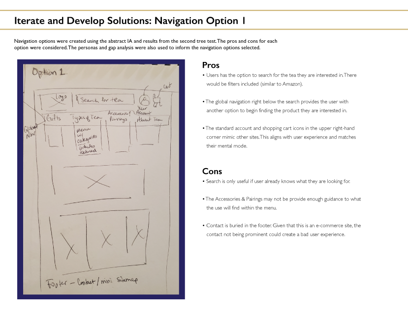
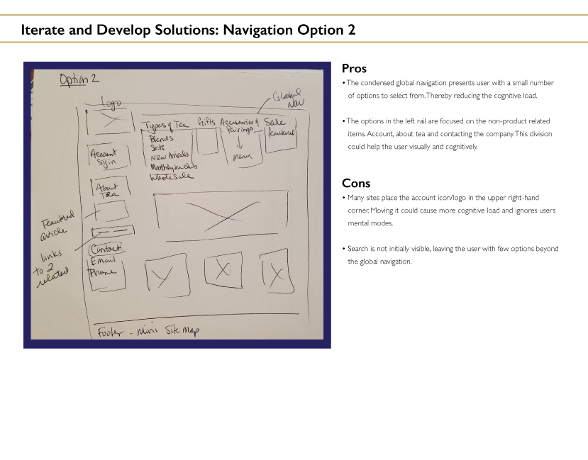
Due to the nature of the my current position, the artifacts I create for projects are proprietary. Below are samples of artifacts I created while completing my UX/UI certification.

About me
I began my career overseeing all digital marketing for a non-profit. After managing social media platforms, email marketing and an e-commerce website, I decided to focus on website management.
I have produced content, managed it and developed my UX/UI expertise by completing a professional certification. Accessibility and ease of use are core to a great website, in my opinion. It is always my goal to help users complete the task they set out to do. Whether that is finding information or filling out a form.
In my free time I’m a dog loving yogi baker martial artist. And yes, I do have more hobbies than that. I just can’t help myself.

Work Experience
Download PDF Resume
Nov. 2021
Professional Program in UX Design
GPA 4.0 | U.C. Berkeley Extension
Earned certification in user experience design by completing seven courses equaling 222 hours of instruction. Areas of study included: visual design principles, diagraming and prototyping, user research, information architecture, content strategy, user interface design and web design with HTML 5 and CSS3.
Nov. 2015 – Present
Senior UX Designer
Salt River Project | Arizona
Optimize website properties to improve usability and overall experience, ensure compliance with WCAG 2.0 accessibility standards, follow SEO best practices and support marketing campaigns and communication initiatives. Synthesize documentation to guide development team including technical specifications, annotated wireframes, inventories and service blueprints.
- Re-architected a dual-language website using content auditing, user research and web analytics.
- Developed a new information architecture for the employee intranet using analytics and user research.
- Improved user experience for program application process using service blueprints, creating user stories and web analytics. Saw a 20-30% increase in successful program application submittals.
June 2010 – Nov. 2015
Digital Content Manager
Desert Botanical Garden | Arizona
Responsible for managing e-commerce website, social media properties and e-mail marketing. Website management included: content, working on functionality upgrades in consultation with developers and search engine optimization.
- Oversaw the launch of three e-commerce sites and developed new information architecture.
- Created reports utilizing web and social media analytics to guide strategy and secure grant funding.
Sept. 2009 – June 2010
Online Media Manager
Barclay Communications | Arizona
Researched, developed and executed integrated public relations campaigns for multiple clients with a focus on digital platforms. Project managed redesign of company website.
May 2009 – Aug. 2009
Online Media Coordinator
Barclay Communications | Arizona
Created tutorials to educate staff about social/online media and how to incorporate it into campaigns. Developed evaluation forms to help guide the development of social media for clients.
Jan. 2008 – May 2009
Master of Mass Communication
Arizona State University | Arizona
While completing graduate degree worked as a graduate teaching and research assistant and as an intern for the City of Chandler.
- Received an Honorable Mention for Collegiate STD Awareness Month Campaign Contest sponsored by the Centers for Disease Control and Preventions.
Oct. 2005 – Jan. 2008
Program Development Specialist
Southwest Human Development | Arizona
Ensured data needed for federal reporting was collected and entered correctly. Duties included working with staff to understand pain points in process and working to improve their experience.
2004
BS Environmental Science
Northern Arizona University, Flagstaff, Arizona

Thanks for stopping by!


